
一个标志不仅仅是一个视觉符号,它是品牌的“形象”,代表着品牌身份,并在顾客心中塑造最初的印象。然而,许多企业,尤其是小型和中型企业,在标志设计过程中经常会犯错误。这些错误可能导致品牌形象不一致、识别度低,或者无法长期使用的标志。
以下是logo设计中最常见的5个错误,以及如何避免它们,从而建立一个强大、专业的品牌形象。
1. 过度复杂的结构 – 导致可扩展性差和应用效果不佳
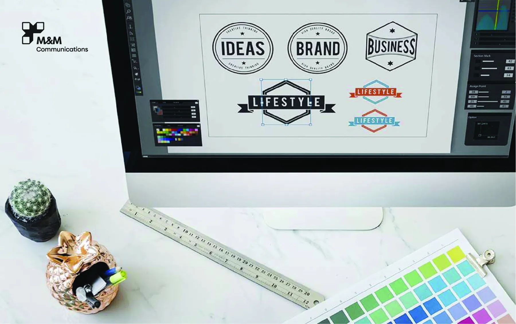
许多品牌为了传达信息,试图在logo中加入过多的细节,导致logo变得混乱,并且在缩放时会失去清晰度。
后果:
缩小后难以阅读。
难以在各种材料上打印
记忆力下降
如何避免:
优先考虑简洁和清晰。一个好的标志必须在所有尺寸和平台上都能被清晰识别。
2. 缺乏市场和竞争对手研究
其中一个最大的错误是,在没有与市场标准进行比较的情况下,仅仅根据个人喜好来设计标志。这往往会导致标志的重复或品牌差异性不足。
后果:
标志与竞争对手非常相似。
很难找到独特的定位。
商标注册面临的挑战
如何避免:
进行市场调研,分析竞争对手、行业趋势和受众的看法,以确保您的标志能够脱颖而出。
This appears to be a visual cue, likely indicating a continuation or further information. Without more context, a precise translation is impossible. Here are a few possibilities, depending on the intended meaning: * **继续... (Jíxù...)** - Continue... (This is a general term for continuation) * **更多信息 (Gèng duō xìnxī)** - More information * **请看下一页 (Qǐng kàn xià yī yè)** - Please see the next page * **请继续阅读 (Qǐng jìxù yuèdú)** - Please continue reading * **(如果是在表格或列表里)... (...)** - (If it's within a table or list, it could simply be the next item) **To get a more accurate translation, please provide more context. For example:** * What is the surrounding text? * Where did you see this symbol? (e.g., on a website, in a document, in a table) * What is the overall topic of the content?专业标志设计 2025:创造令人难忘的品牌标志,以产生共鸣 或者更简洁一些: 专业标志设计 2025:打造令人难忘的品牌标志,引发共鸣
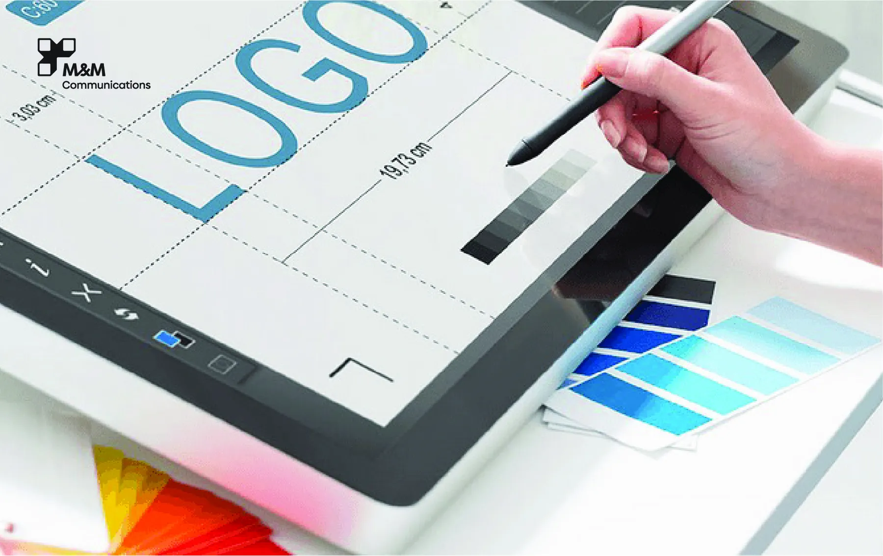
3. 使用过多的颜色
有些品牌希望通过使用多种颜色来使他们的标志更加醒目,但这样做可能会导致视觉上的混乱和品牌体系的不一致。
后果:
印刷和数字媒体上的颜色不一致
很难在不同品牌材料上应用。
以下是一些可能的翻译,具体选择取决于语境: * **缺乏专业的品牌形象** (Quē fàn zhìyè de biǎopìn xiàng) - This is a more formal and direct translation. * **品牌形象不够专业** (Biǎopīn xiàngguǎn bù gèng zhuānyè) - This is a more concise and common translation. * **品牌形象不够专业,显得不够成熟** (Biǎopīn xiàngguǎn bù gèng zhuānyè, xiǎn de bù gèng chéngshú) - This adds the nuance that the lack of professionalism makes the brand seem immature. * **品牌形象不够专业,显得不够有格调** (Biǎopīn xiàngguǎn bù gèng zhuānyè, xiǎn de bù gèng yǒu gètí) - This emphasizes the lack of a distinct style or identity. Therefore, the best translation depends on the specific context. If you want a general and neutral translation, **品牌形象不够专业** is a good choice. If you want to emphasize the lack of maturity, **品牌形象不够专业,显得不够成熟** is better.
如何避免:
坚持使用2-3种主要颜色。选择能够反映您品牌个性的色调,并能在不同平台上良好发挥作用。
4. 不合适的字体 - 弱化的品牌形象
排版至关重要,但经常被忽视。许多标志都使用了通用或不合适的字体,导致缺乏专业性和情感联系。
后果:
品牌信任度降低
难以辨认的标志
错误的品牌个性表达
如何避免:
选择与品牌调性和身份相符的、定制或精心挑选的字体。 确保字体易于阅读且比例协调。
5. **缺乏长远品牌愿景的设计**
有些品牌会根据短期趋势来设计标志。随着业务的发展,标志会变得过时,从而迫使他们频繁进行品牌重塑。
后果:
品牌知名度下降
更新品牌资产的成本高昂
保持一致性的困难
如何避免:
在设计标志时,请务必考虑长期的品牌愿景。确保标志能够体现核心价值观、品牌定位以及未来的发展方向。
专业标志设计,由 M&M Communications 提供
在 M&M Communications,我们的品牌与创意团队遵循一种战略性和全面的设计流程,以确保每个标志既具有视觉上的吸引力,又与品牌形象紧密相连。我们的工作流程包括:
深入的市场和受众研究
品牌定位与概念开发
以下是一些可能的翻译,具体选择取决于上下文: * **多种创意设计方向** (Zòng duō chuàngyì shèjì fāngdào) - This is a very direct and common translation. * **多个创意设计方案** (Duō gè chuàngyì shèjì fāng'àn) - This emphasizes the "solutions" or "approaches" to the design. * **多种设计思路** (Zòng duō shèjì sīlù) - This focuses on the "ideas" or "lines of thought" behind the design. * **不同的创意设计方向** (Bù tóng de chuàngyì shèjì fāngdào) - This emphasizes the "different" aspects of the design directions. The best choice depends on the specific context. If you can provide more context, I can give you a more precise translation.
一个连贯的品牌标识系统
完整的文件交付和品牌指南
我们致力于为您提供独特、专业、多功能且符合您品牌形象的标志设计。
This appears to be a visual cue, likely indicating a continuation or further information. Without more context, the best translation would be: **继续...** (Jízhù...) - Continue... This is a general and common translation that works in many situations. If you can provide more context, I can give a more precise translation. For example: * If it's a list, it could be: "以下是..." (Yǐxià shì...) - The following is... * If it's a question, it could be: "请继续..." (Qǐng jìzhù...) - Please continue... * If it's a table, it could be: "请继续填写..." (Qǐng jìzhù tiánxiě...) - Please continue filling in... Without more information, "继续..." is the safest and most accurate translation.专业Logo设计流程与最佳实践 (2025年越南指南)